Hyggut
BRANDING + PACKAGING DESIGN
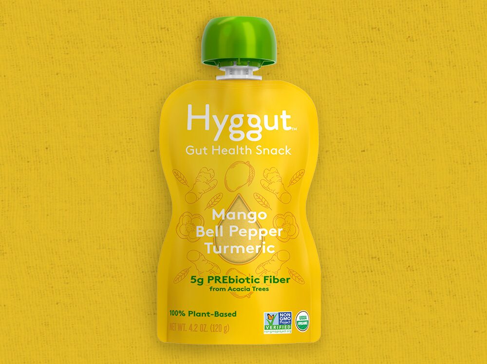
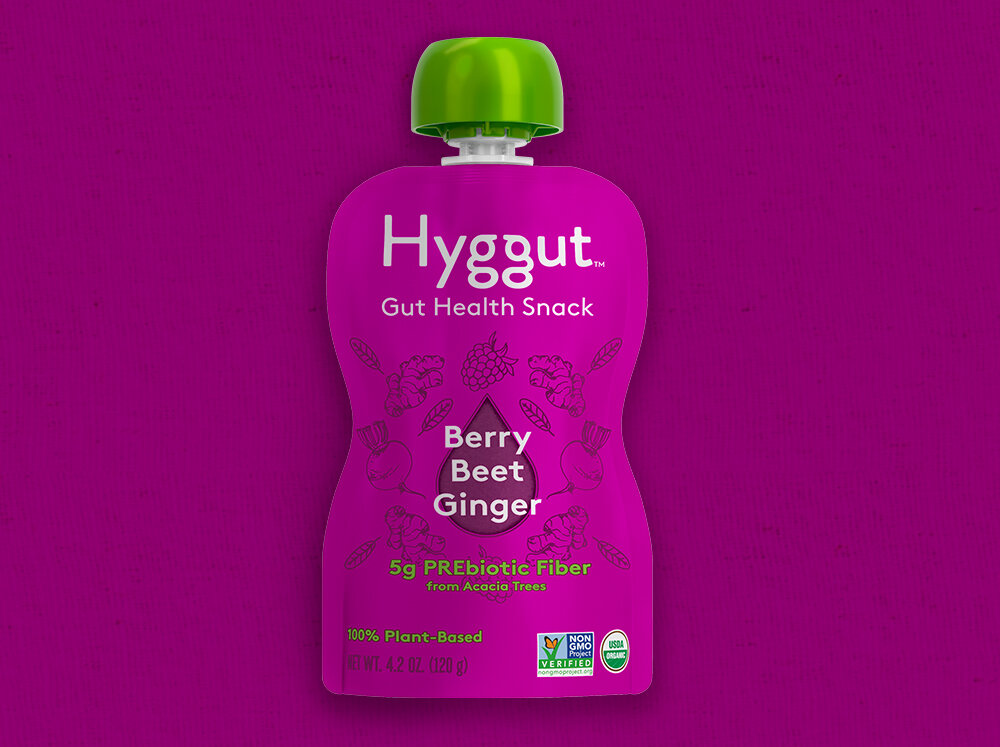
Hyggut is an innovative product launch from French-based health food company Materne, developed to explore the connection between wellness, gut health, and everyday nourishment. For this brand identity and packaging design project, the visual system was designed to express both function and feeling—bringing warmth and approachability to the science of gut health.
The custom logotype visually celebrates this concept through curved letterforms inspired by the natural shape of the gut. The facing “g’s” are intentionally turned toward one another to symbolize connection, balance, well-being, and the philosophy of “hygge” at the heart of the brand.
One of Hyggut’s key ingredients is sap from the Acacia tree, which inspired the creation of a drop-shaped window on each pouch, allowing consumers to see the product inside and reinforcing transparency and trust. An energetic, expressive color palette was developed to attract health-conscious consumers seeking brands that feel authentic, modern, and premium, while ensuring strong visibility and impact on retail shelves.


Let’s work together
I provide beautiful design that helps you achieve your sales goals and drive revenue to your business. To discuss your upcoming design project book a call with me.